A global dance app that fosters community and learning.
Duration: October 1, 2019 – November 1, 2019
Tools: Adobe XD, Adobe Illustrator
Role: UX/UI (Product) Designer, UX Researcher, Creative Director
Overview: I designed this global dance app during the Fall 2019 semester to allow dancers to learn different styles of dance around the world through their phones, without having to make the trip to the origin sites. This app allows dancers to favorite certain dances they like, create different playlists for different dance styles they want to learn, read more about these dances, follow along tutorials to these dances, upload videos of themselves trying out these dances, and receive critiques and meet-up requests from local dancers in their area.
01. Challenges + Goals
The Problem: Learning different dance styles can be difficult if the resources and information are not immediately present. If dancers do not seek out to learn different dance styles, they often get stuck in a bubble with the same people and learning the same techniques.
1. To design an accessible UI/UX interface for dancers to improve and expand their dance vocabulary by learning different styles from global influences.
2. To increase awareness about different cultures and their dance.
3. To create a community through dance.
02. UX Research + Scope
Target Users: Young dancers (ages 15–30) who have an interest in expanding their dance style vocabulary
I started out this design process by researching different ways young dancers (mainly collegiate-level) learn dance, sourcing my information through my peers who are dancers, personal experiences on different dance teams in college, and testing out different ways to learn dance in a digital space. From this point, I developed the scope of the project based on my research and challenges/goals, finalizing on the app using these methods for learning dance:
Favorite a Dance
Allows users to save certain dances they like and want to learn. Users can access these playlists on their profile, which archives all favorites.
Dance Playlists
Allows users to curate an compilation of different dances they want to learn. Users can access these playlists on their profile, which archives all playlists.
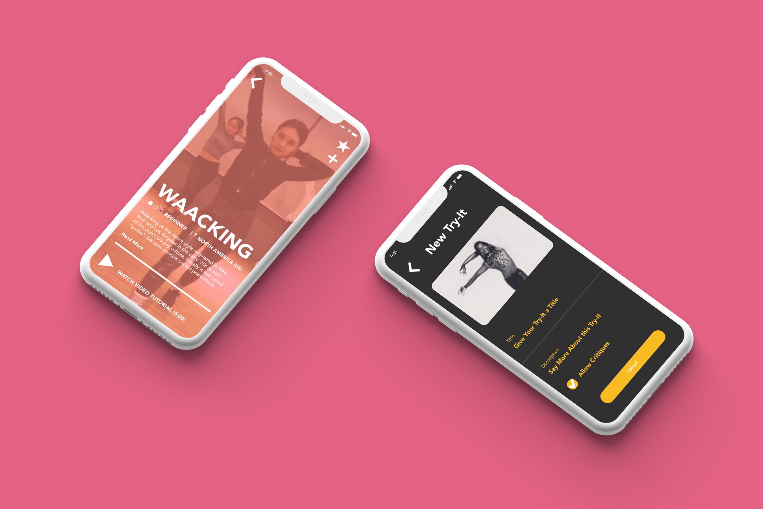
Video Tutorials
The core of this app. These short tutorials allow users to follow along and learn dances. Helpful tips are given so that users can improve the way their body looks in real-time while learning a dance.
Read More
Allows users to read a brief history of a certain dance style.
Set Difficulty
Allows users to change the video tutorial based on their skill level on a certain style.
"Try-It"
Allows users to record themselves trying out different dance styles and upload these videos onto the platform for other users to see.
Direct Message Critiques
Allows users to receive feedback from other users on their "Try-Its" in a personal way so that they don't feel pressured by public comments.
Meet-Up Requests
Allows users in a close proximity to meet-up so they can dance together and help each other out with dances.
03. Structure
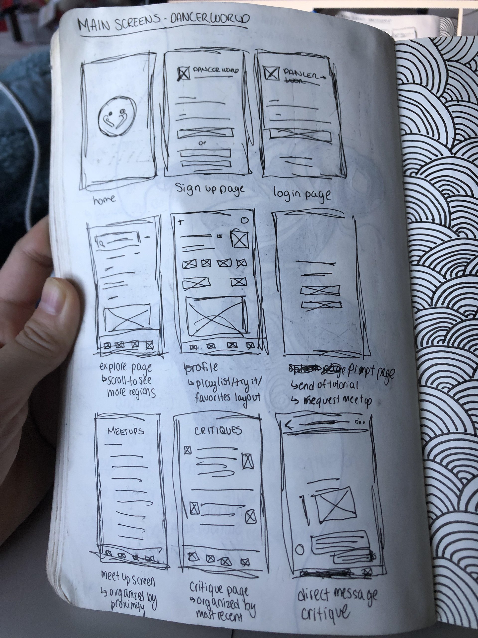
After developing the scope for this project, I sketched out the basic app structure and mapped out different user flows.
04. Skeleton
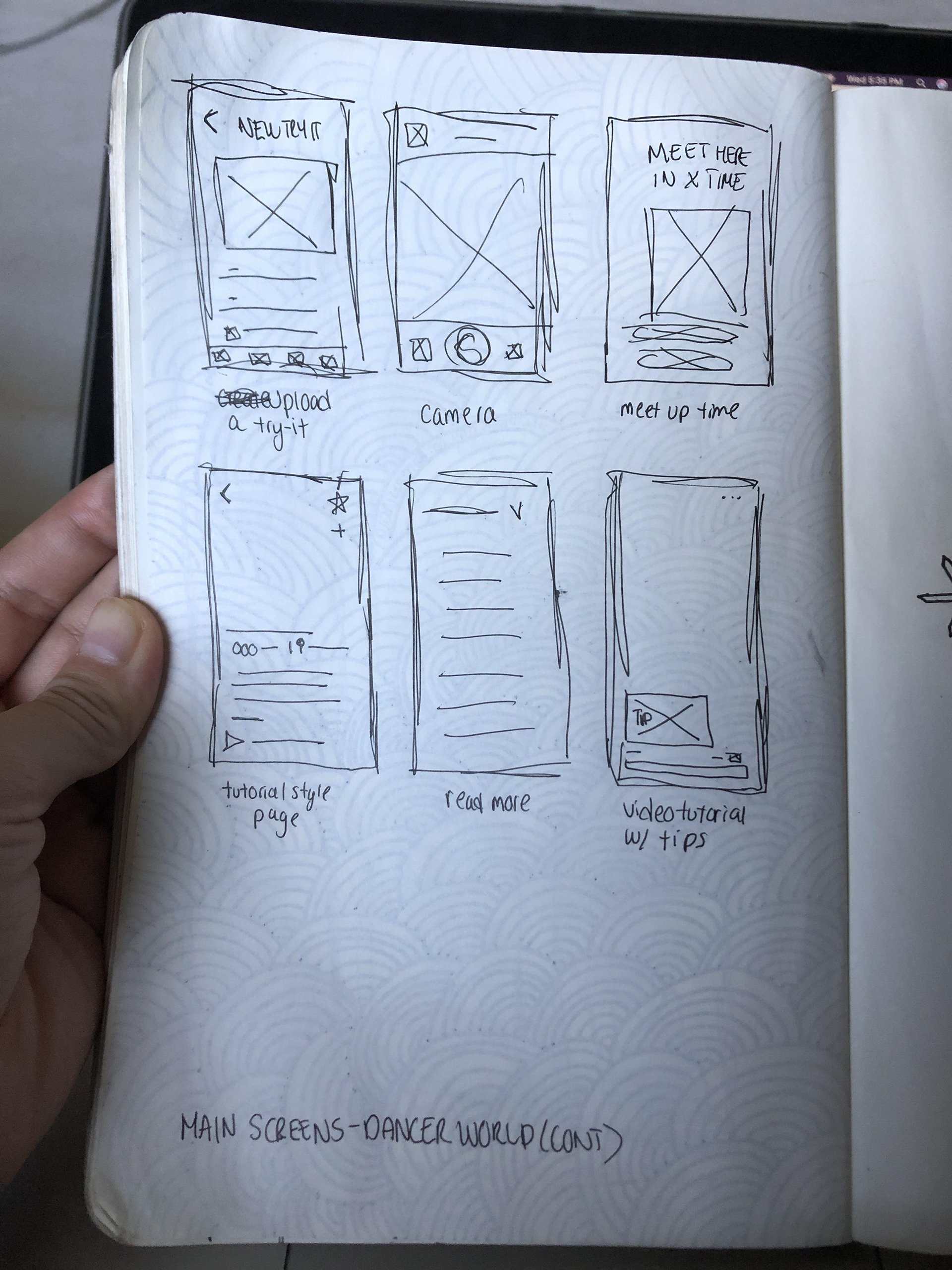
After developing the app structure, I sketched out wireframes and developed a low-fidelity prototype.
05. Surface
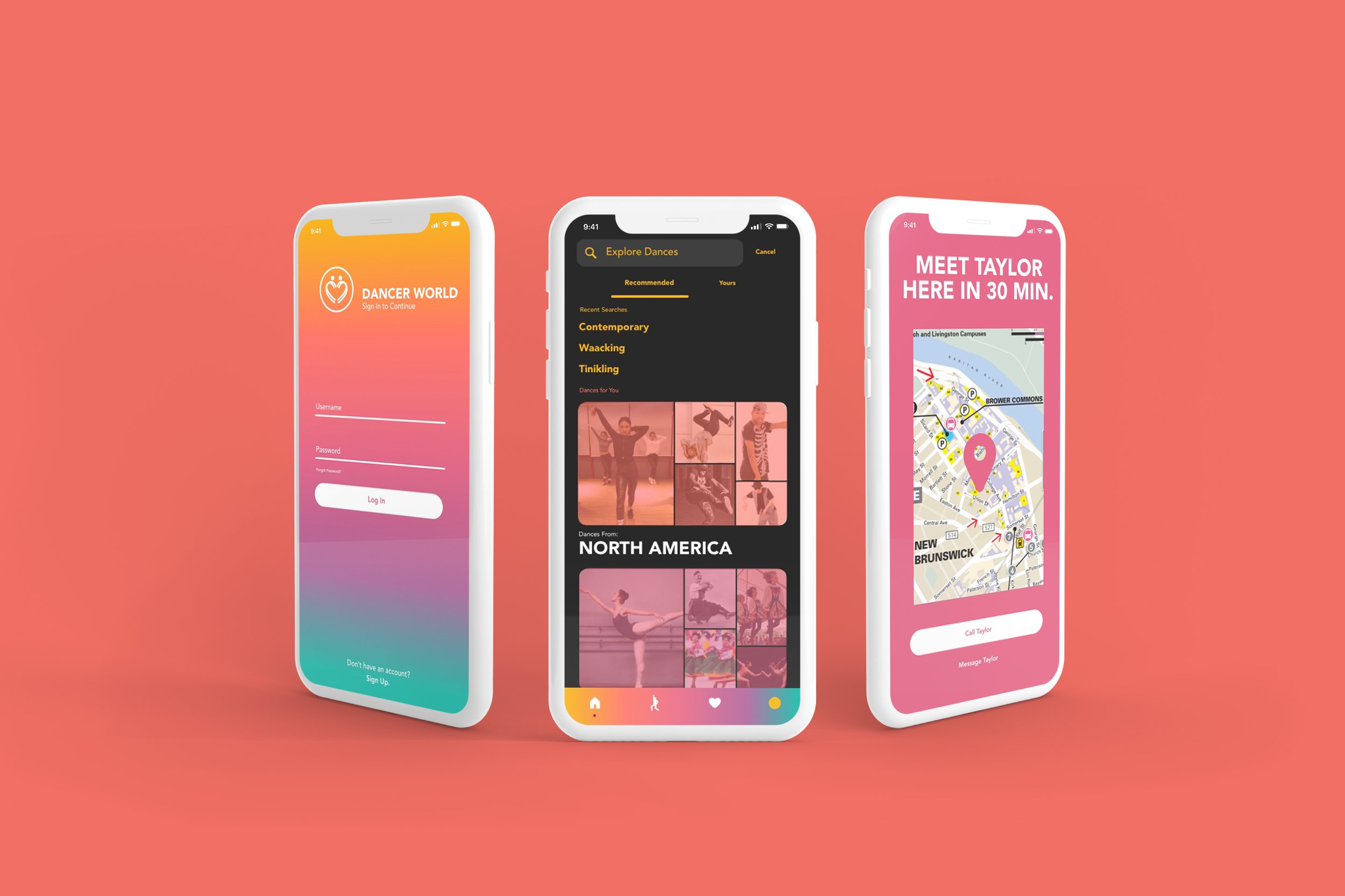
I wanted the stylistic choices behind this app to reflect the diverse community aspect of dance. I resolved these challenges by designing the app around these elements to help make an experience that creates an optimal and fun digital learning environment:
Bright Colors
Gives the app a bright, energetic feel.
Large Buttons
Makes the key touchpoints for this app more accessible.
Minimal Icons
Contributes to the clean feel of the app; defined lines and shapes are also emphasized by the minimal nature of the icons. This is suggestive of the defined lines and shapes in dance formations/body movements.
Linear Typography
I used Bebas Neue in the weight Regular for this app. I wanted a typeface with clear, linear forms to nod to the formal aspects (i.e. shapes the body makes while in motion) of dance.
Large, Humanistic Typography
I also used Avenir in the weights Regular and Heavy for this app. I wanted a humanist typeface to accent the sharp, linear characteristics of Bebas Neue.
Video Grids
Organizes saved video tutorials by chronological order so users can access them later.
06. Identity
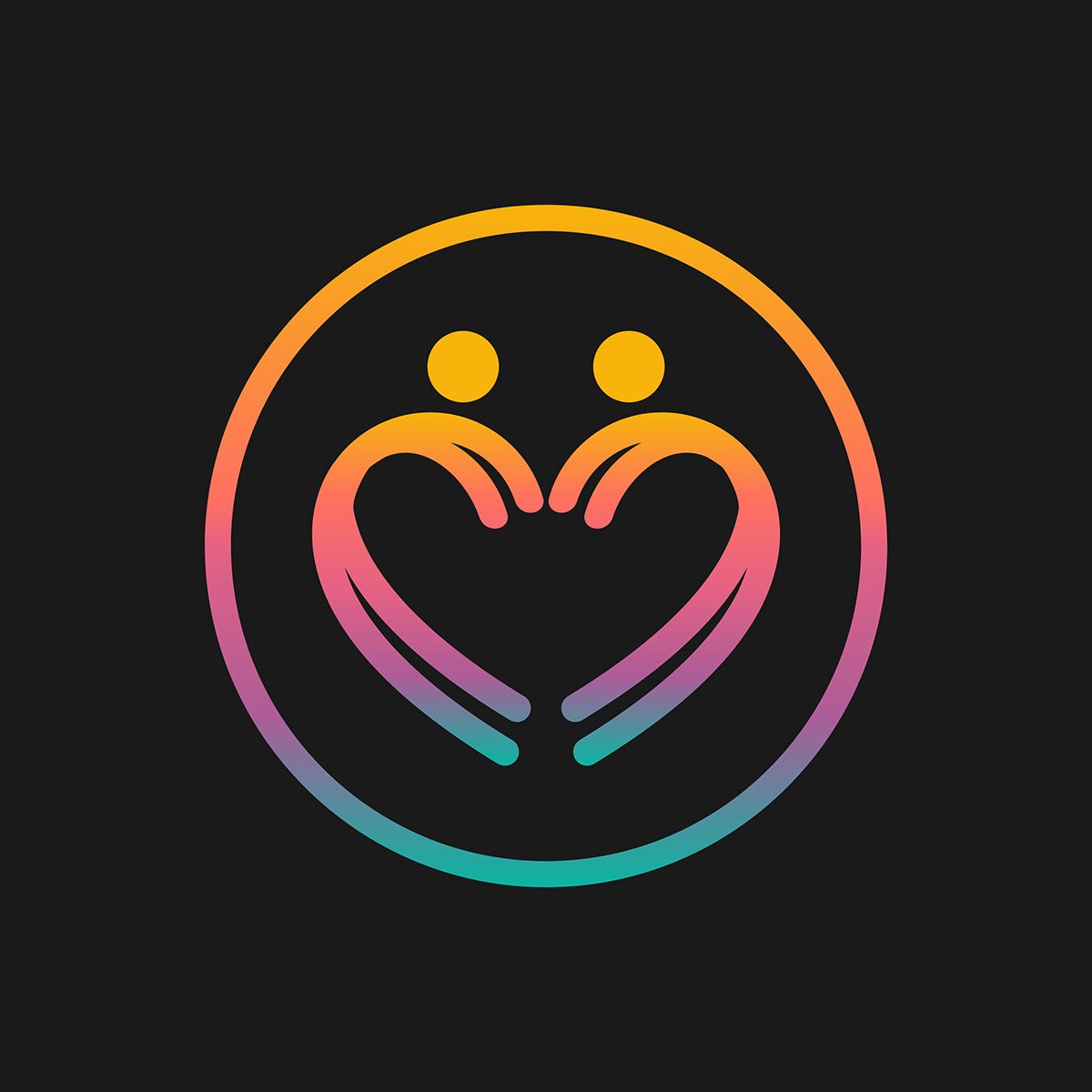
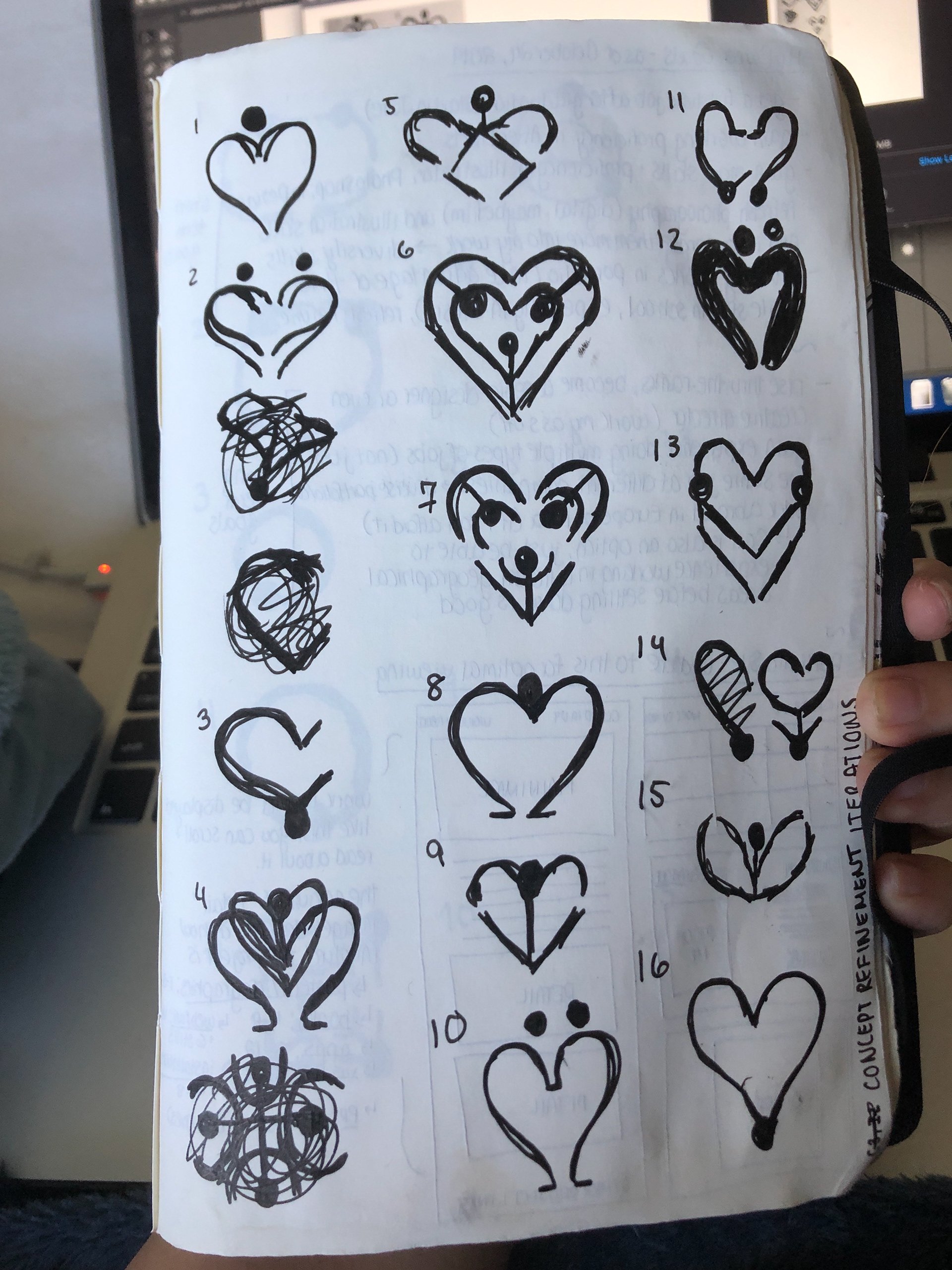
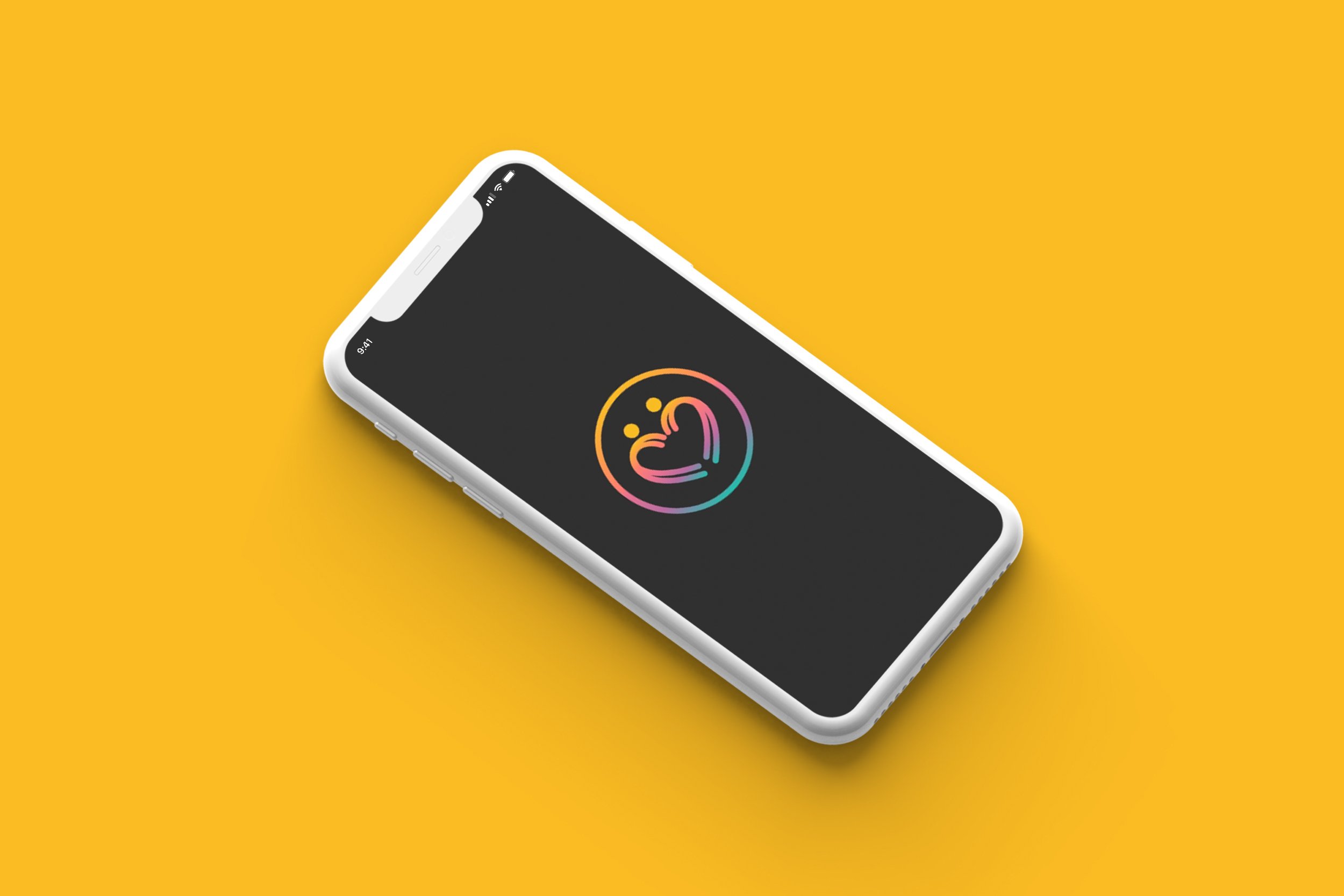
The identity is a circle surrounding two dancers jumping away from each other, which forms a heart. This reflects how the dance community is united through a passion for dance. The gradient treatment reflects the diversity of the dance community. I started this process by sketching out different ways dance can form a heart. Then, I cleaned up the sketch I liked the best on Illustrator and applied a gradient treatment to it.
Final Designs
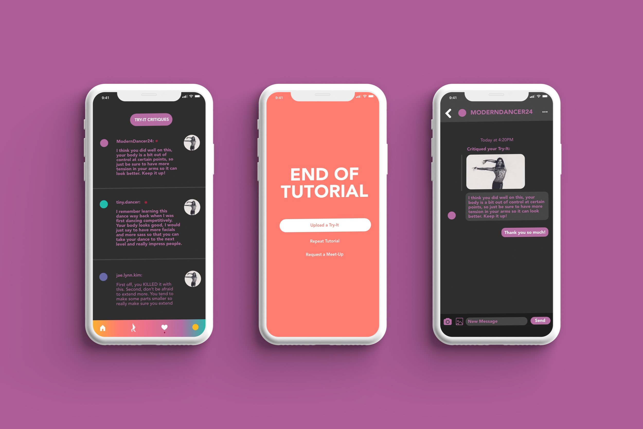
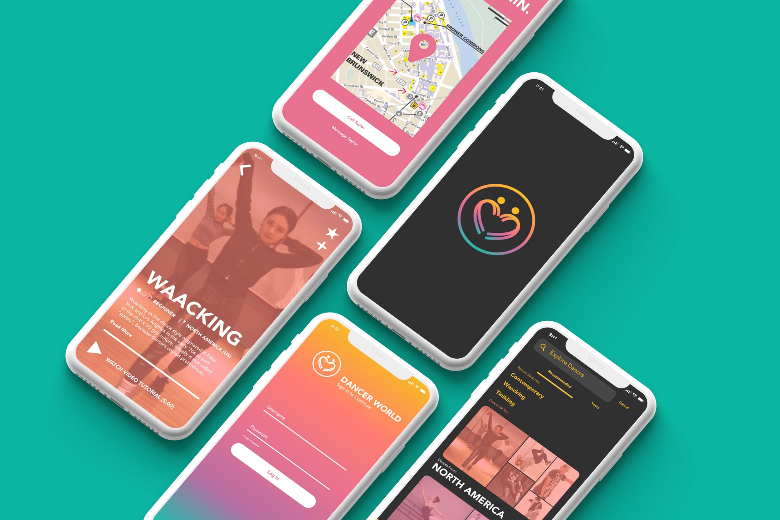
Learnings
For this project, I wanted to challenge my UX/UI design and prototyping capabilities and and try my hand at more involved layout designs. This project was a lot more involved than my first UX/UI project (Find Yourself) in-terms of both design and concept, and it was challenging for me to incorporate so many features to this app that optimize the online dance learning experience. A critique that stood out to me for this project was to make the app design and structure emulate dance as an activity. This app lays out basic needs for learning dance online through its existing design and structure, but it made me think of ways to push both these aspects to suit dance as an activity more.


