Branding for a fictional K-Pop dance studio.
Duration: August 23, 2019 – September 13, 2019
Tools: Adobe Illustrator, Adobe Photoshop
Role: Graphic Designer
Overview: Hallyu Dance Company is a fictional dance studio that specializes in teaching different dance styles popular in Korean Pop (K-Pop) choreographies. "Hallyu" refers to the "Korean Wave", a term that refers to the explosive boom of Korean pop culture on the global stage. "Hallyu Dance" is a pun on the phrase, "How Do You Dance".
01. Color + Pattern Exploration
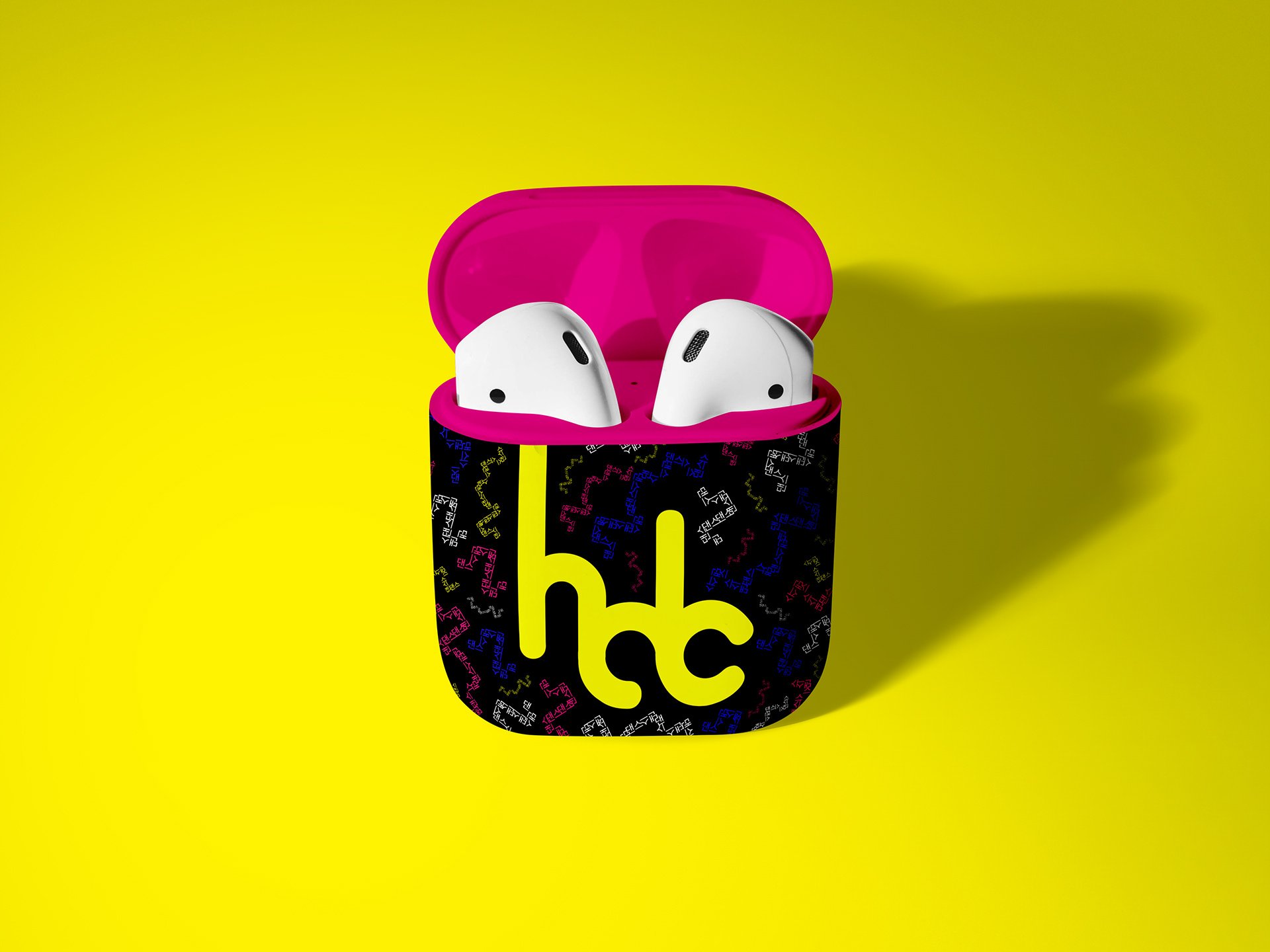
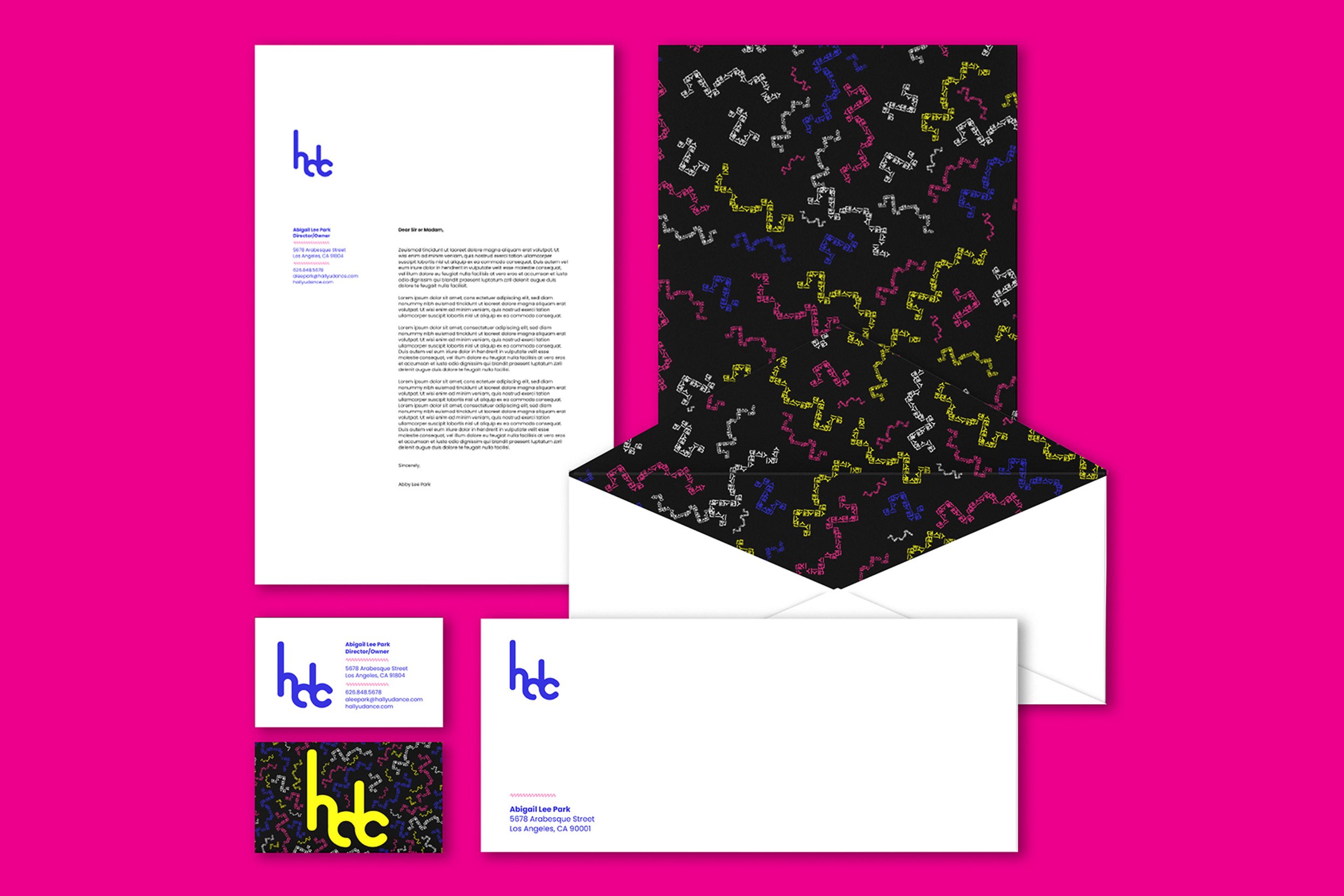
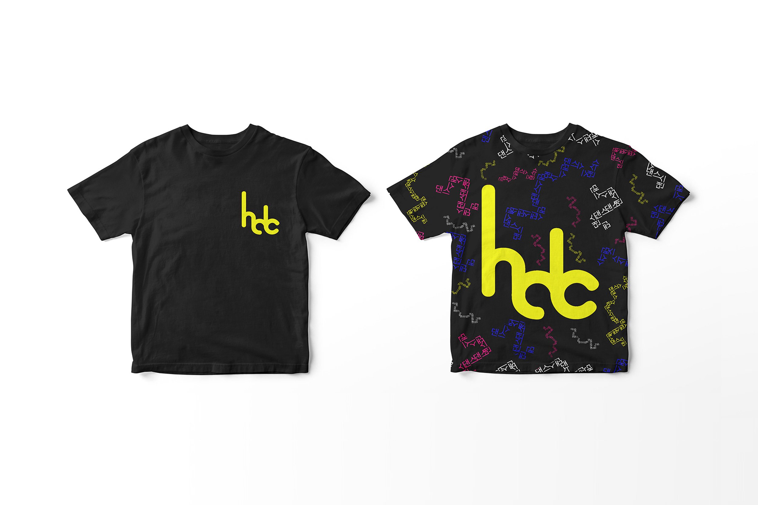
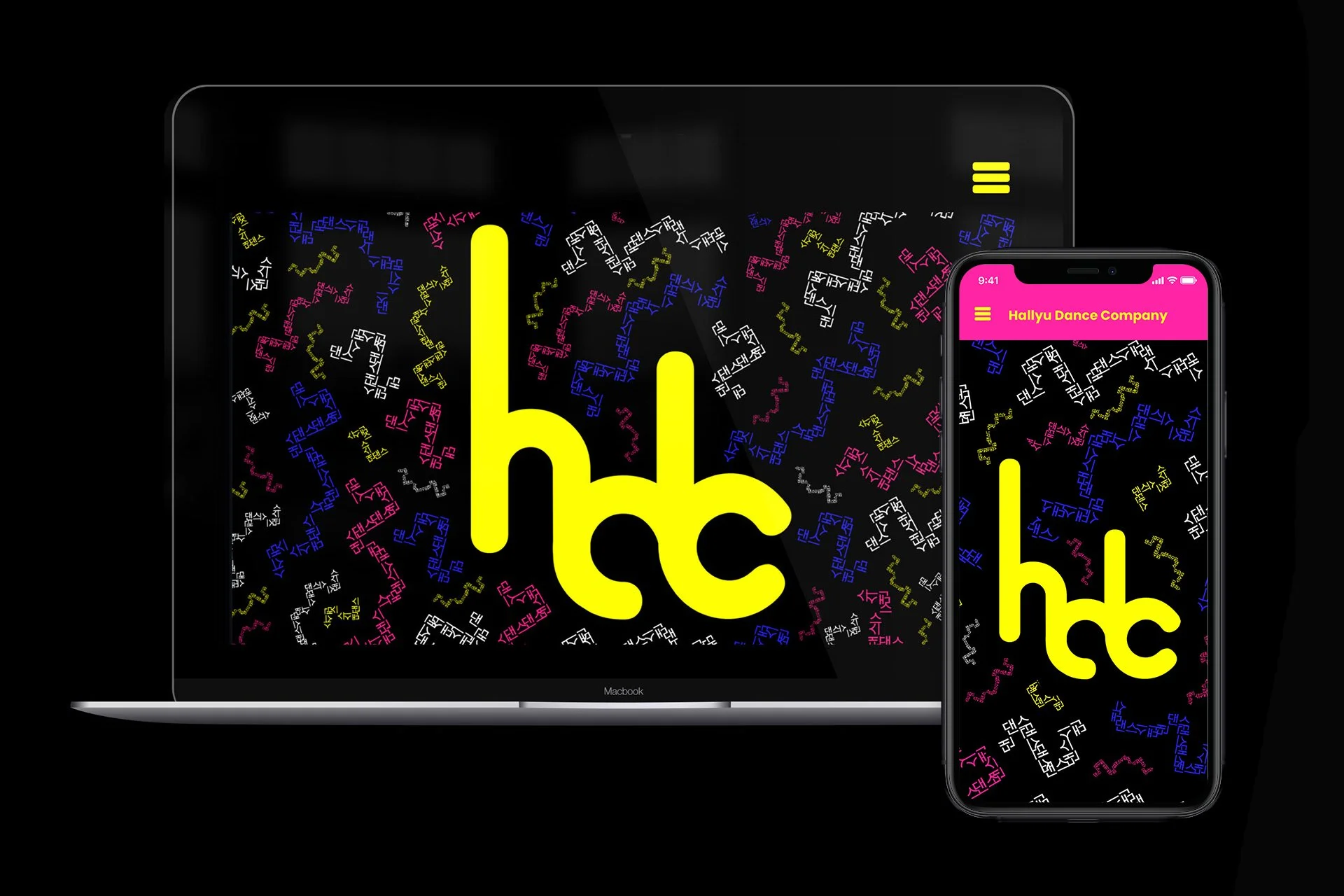
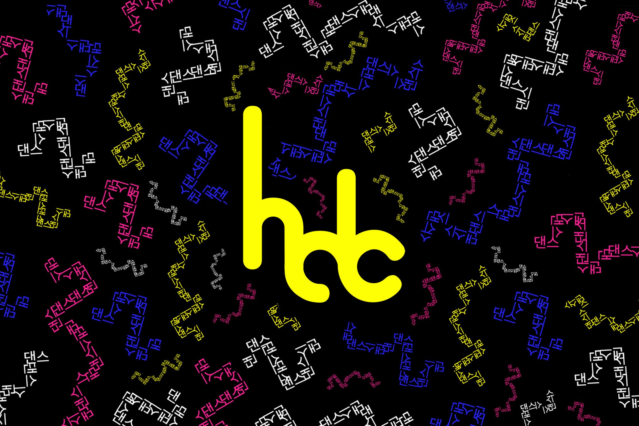
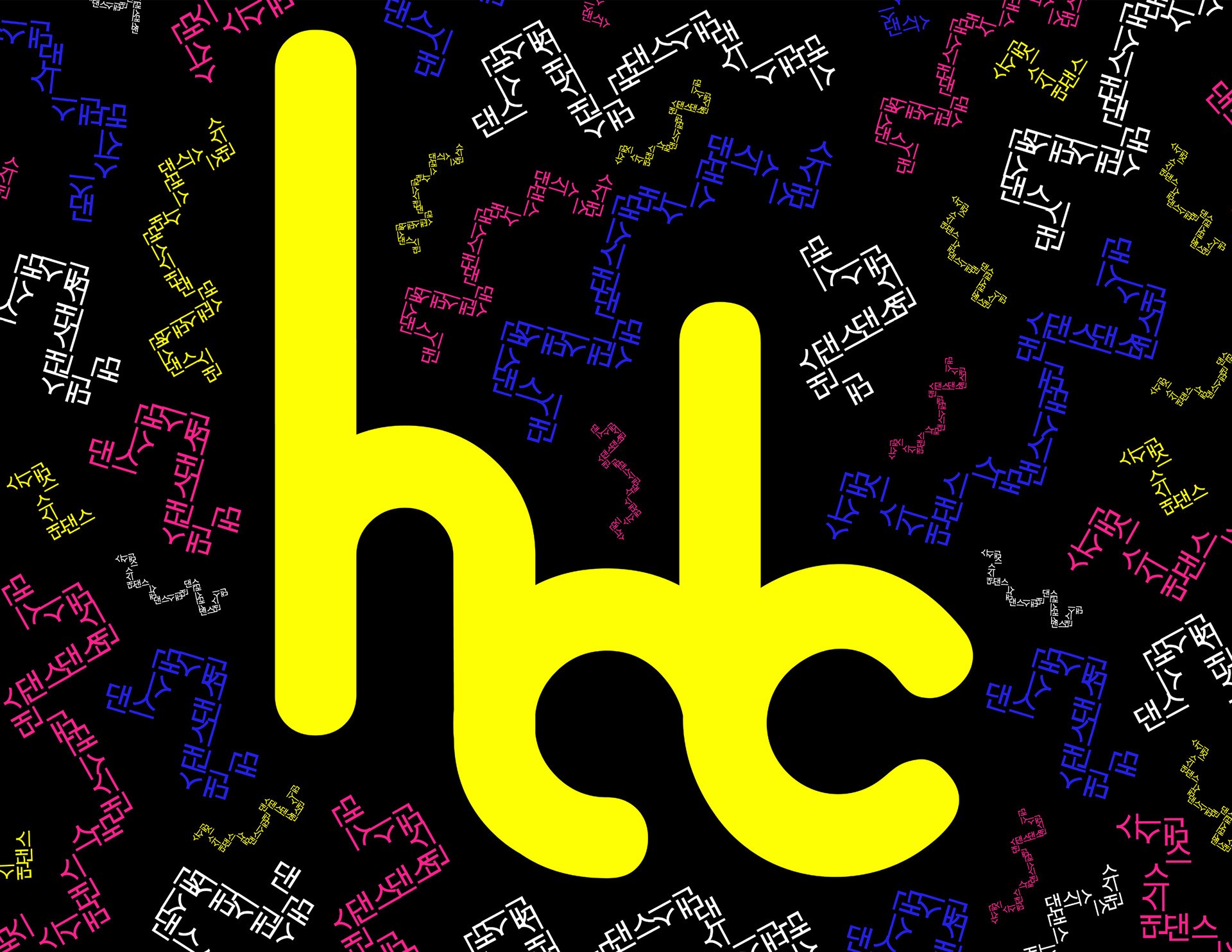
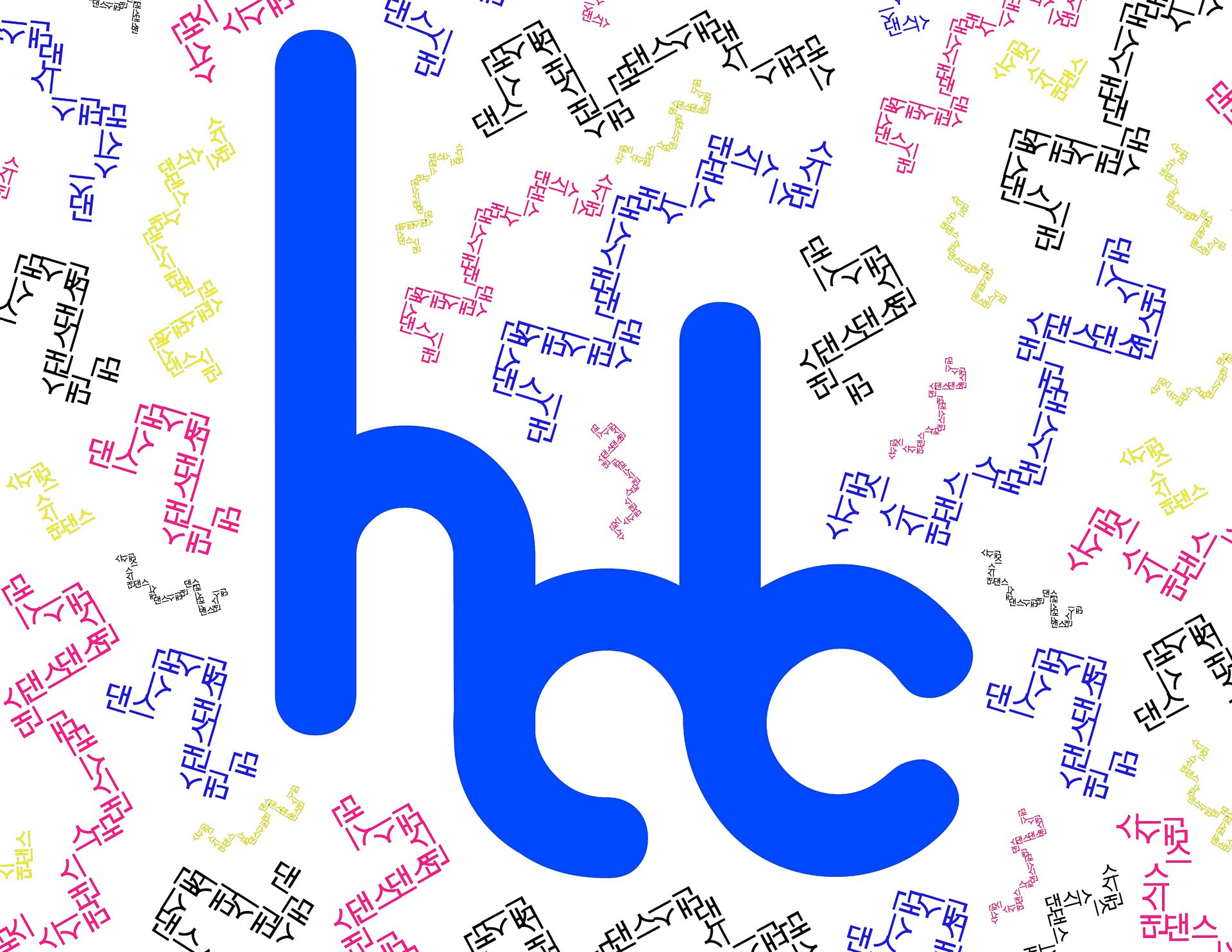
This color scheme is a modern take on the Obangsaek, the traditional color scheme found in traditional Korean artworks. This scheme represents the five orientations (north, south, east, west, center). The modernized color scheme and the pattern (dynamic squiggles constructed from the Korean word for "dance") reflects the newness of K-Pop to Korean culture and the different planes and dynamics the body goes through while dancing.

02. Typography Exploration
I chose Alba for the main logo type for its fluid and energetic feel. I wanted a typeface that would convey the fluidity of highly-trained dance movements, the energy of K-Pop music and choreographies, and a strong personality (like the charisma K-Pop idols radiate when they dance on-stage).
For the body type, I chose Poppins for its geometric letterforms. I wanted a typeface that would allude to the different body shapes made while dancing as well as the different shapes of dance formations in K-Pop choreographies. The slight irregularities in this typeface brings out a more human quality, much how each idol brings their own flavor to a choreography.

03. Logo Exploration
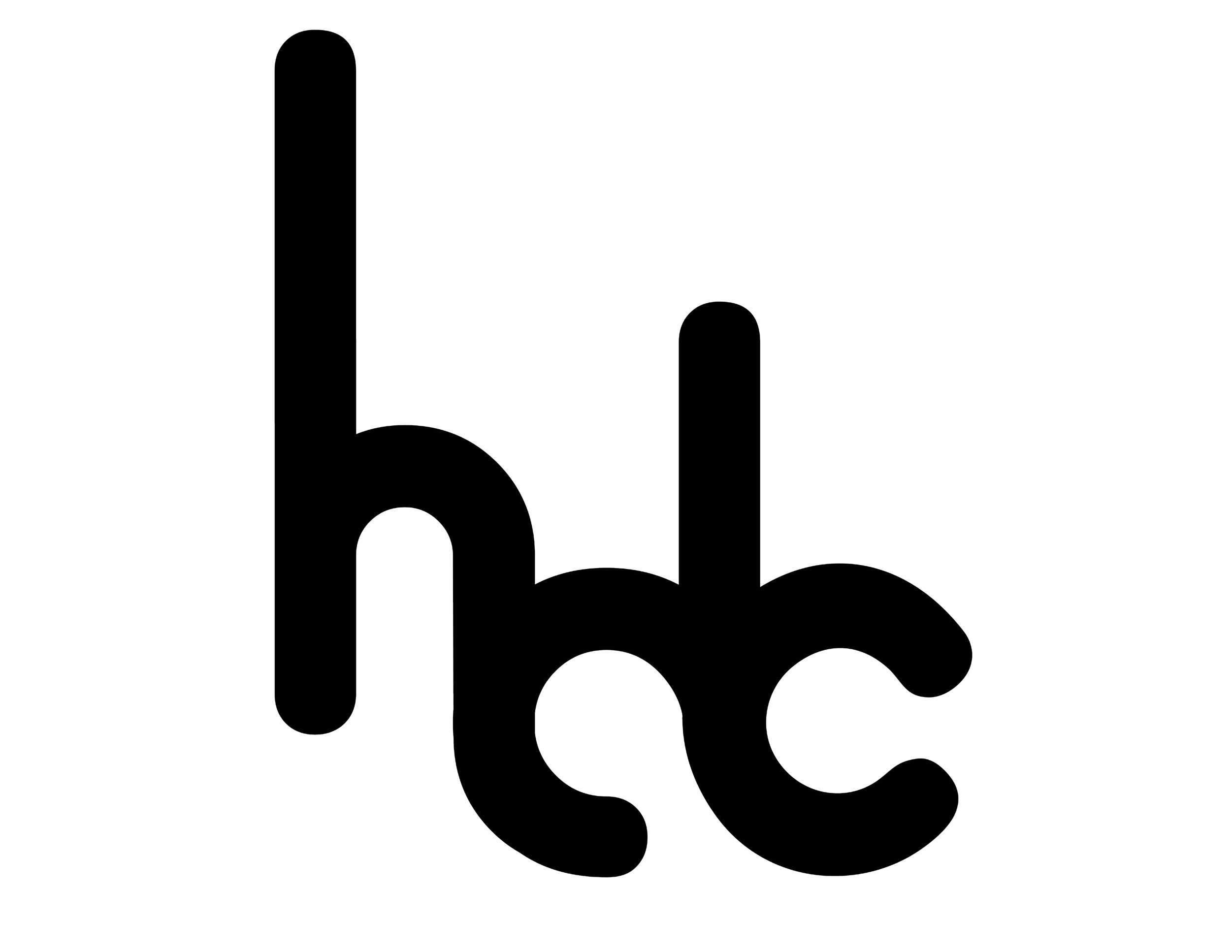
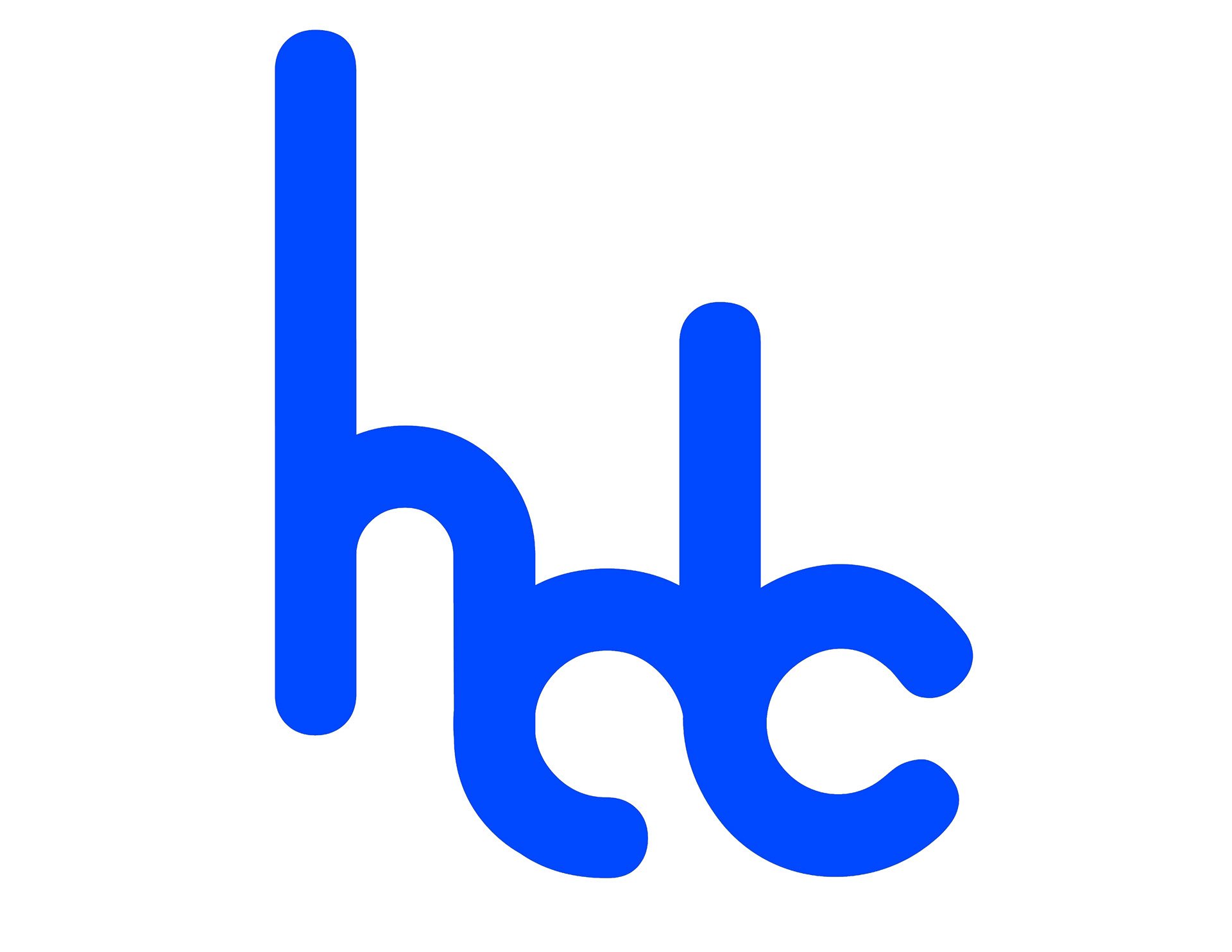
This logo is inspired by the logo of Electric Daisy Carnival (EDC), one of the biggest electronic music festivals. Electronic dance music (EDM) is heavily integrated in modern K-Pop tracks, and gives the music and their respective choreographies a highly energetic and dance-able quality. I wanted to emulate these qualities by writing out the word "Hallyu" typeface Alba and rearranged to form the acronym "HDC". I wanted the letterforms of this logo to flow together, similar to how professionally-trained K-Pop idols and dancers have movements that are fluid and graceful, yet energetic.
Shown in the gallery below are pictures documenting the final mark (1) + logo (2), alternate versions of the logo (3-7), and exploration sketches (8).

Final Designs